top of page


PACKAGING DESIGN
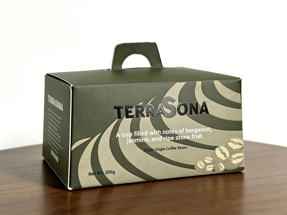
A visual identity for a specialty coffee brand that translates “listening to the land” into form.
- Logo: Textured type evokes terraced fields; the “S” doubles as contour lines and sound waves—rooted in olive green and black.
- Structure: Trapezoidal packaging mirrors terrace shapes, with contour graphics reinforcing the visual language.
- Detail: Hand-drawn coffee leaves add organic texture; a cut-out strip on the back reveals real beans, bridging concept and product.

.jpg)
bottom of page